AnyLog with PowerBI + Microsoft Office Suite
Connect Excel, PowerBI, and other Microsoft Office tools to AnyLog via REST to build graphs and tables.
The following provides insight as to how to generate graphs and images using Microsoft PowerBI with data from AnyLog. The same process can be done with Excel and other Microsoft tools.
Sample REST request
In order to support PowerBI, return data as a list of JSON values without the statistical information.
Sample cURL request
curl -X GET 10.1.2.10:2149 \
    -H 'command: sql aiops format=json:list and stat=false "SELECT date(timestamp) as timestamp, min(value) as min, avg(value) as avg, max(value) as max FROM lic1_mv group by timestamp ORDER by timestamp limit 10"' \
    -H "User-Agent: AnyLog/1.23" \
    -H "destination: network" -w "\n"
Sample Output (the data is returned as a list of JSON objects).
[
    {"timestamp": "2021-12-17", "min": 16.07562231854013, "avg": 16.07562231854013, "max": 16.07562231854013},
    {"timestamp": "2021-12-18", "min": 0.7819949317261932, "avg": 37.58098167042068, "max": 85.13897566679766},
    {"timestamp": "2021-12-22", "min": 3.545549704985503, "avg": 44.07391736121831, "max": 75.688516046041},
    {"timestamp": "2021-12-23", "min": 30.13388089233143, "avg": 54.983077931262265, "max": 84.77061503184196},
    {"timestamp": "2021-12-29", "min": 17.614363625825547, "avg": 47.44901351353519, "max": 79.27651061410472},
    {"timestamp": "2021-12-30", "min": 12.324781800659816, "avg": 45.14157473898287, "max": 78.54948001563031},
    {"timestamp": "2022-01-01", "min": 19.389259167237835, "avg": 62.144516285293186, "max": 98.28053568049772},
    {"timestamp": "2022-01-02", "min": 50.596673938692426, "avg": 50.596673938692426, "max": 50.596673938692426},
    {"timestamp": "2022-01-08", "min": 53.17291222256768, "avg": 78.21358089166576, "max": 93.42429844531414},
    {"timestamp": "2022-01-09", "min": 54.664901456750904, "avg": 75.73146536262269, "max": 96.79802926849446}
]
Using PowerBI
-
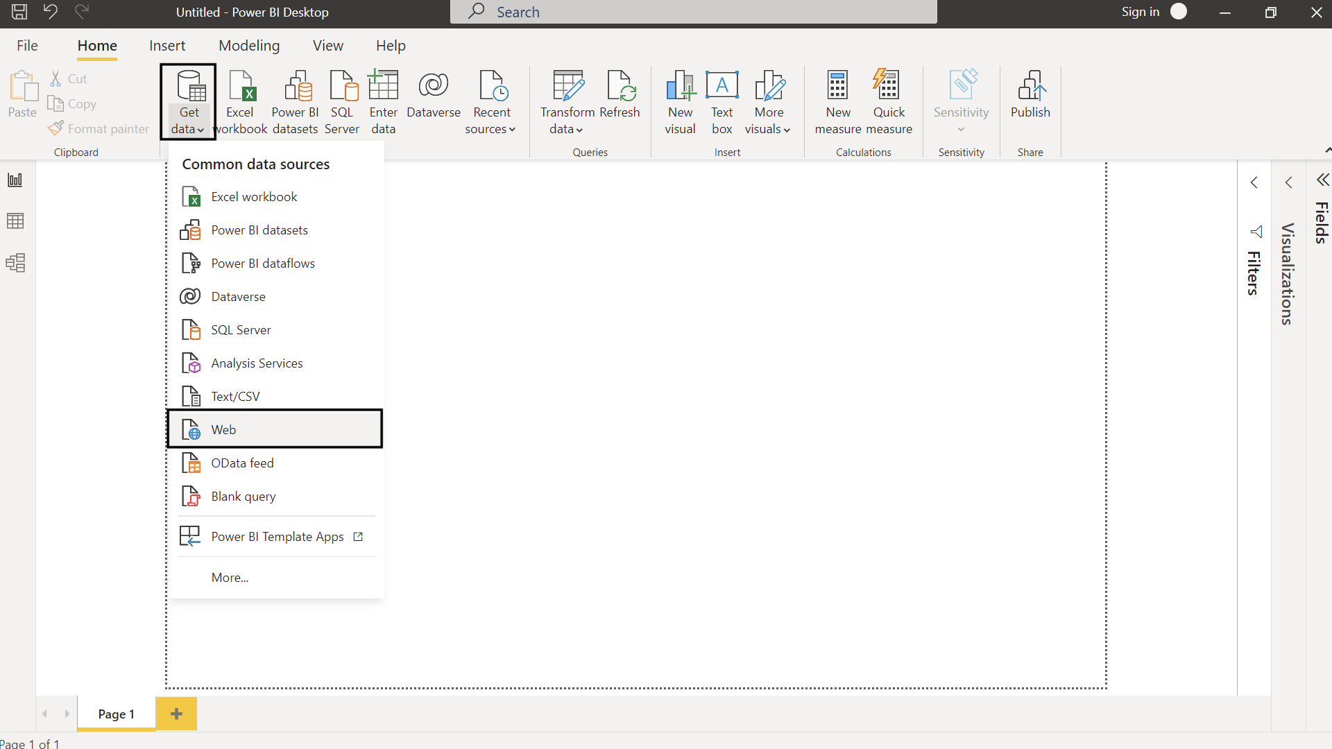
Under Get Data open Web
-
In the Advanced option fill out the URL and HEADER parameters with
command,User-Agent, anddestination. Once the form is filled out, press “OK”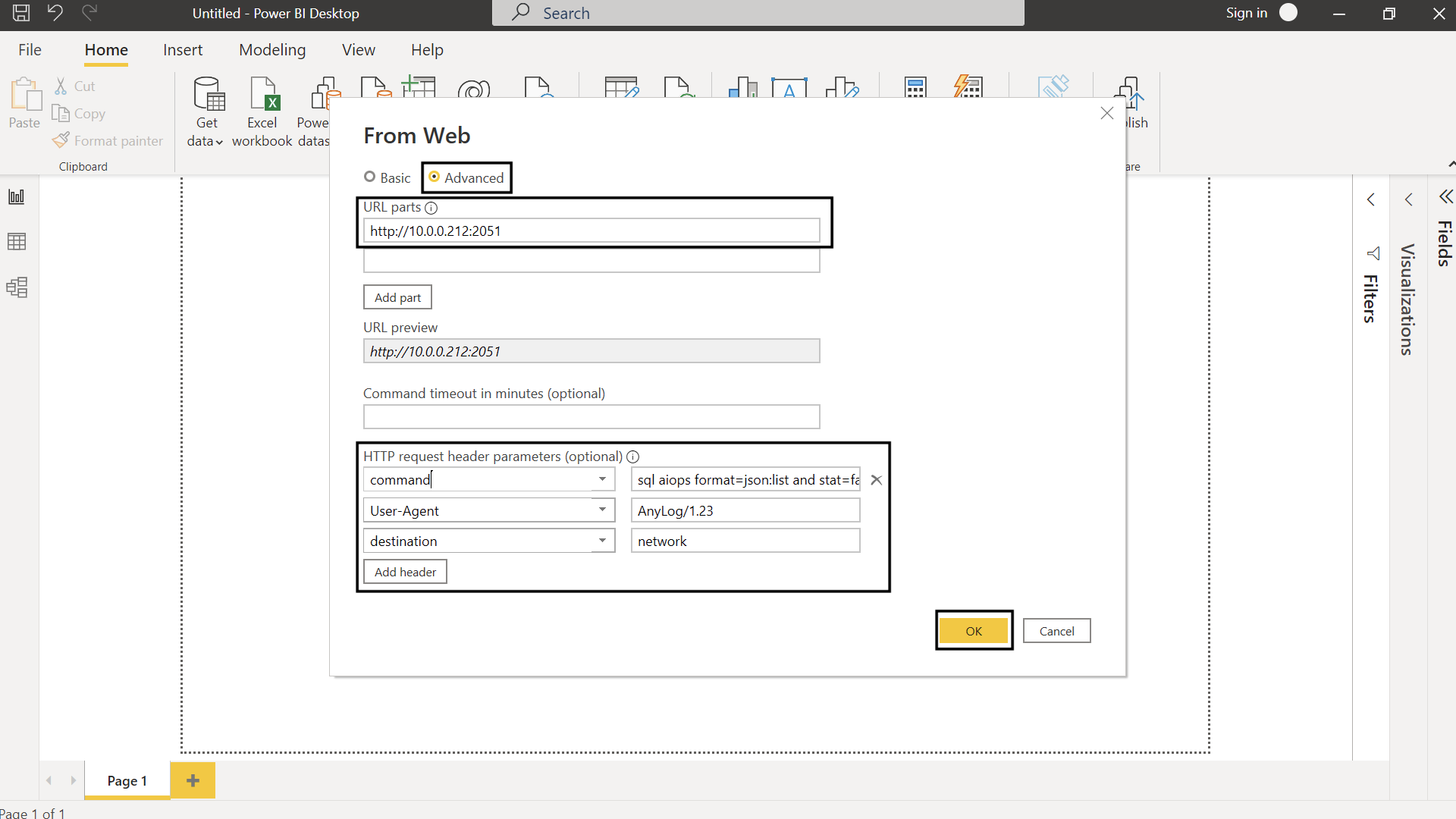
-
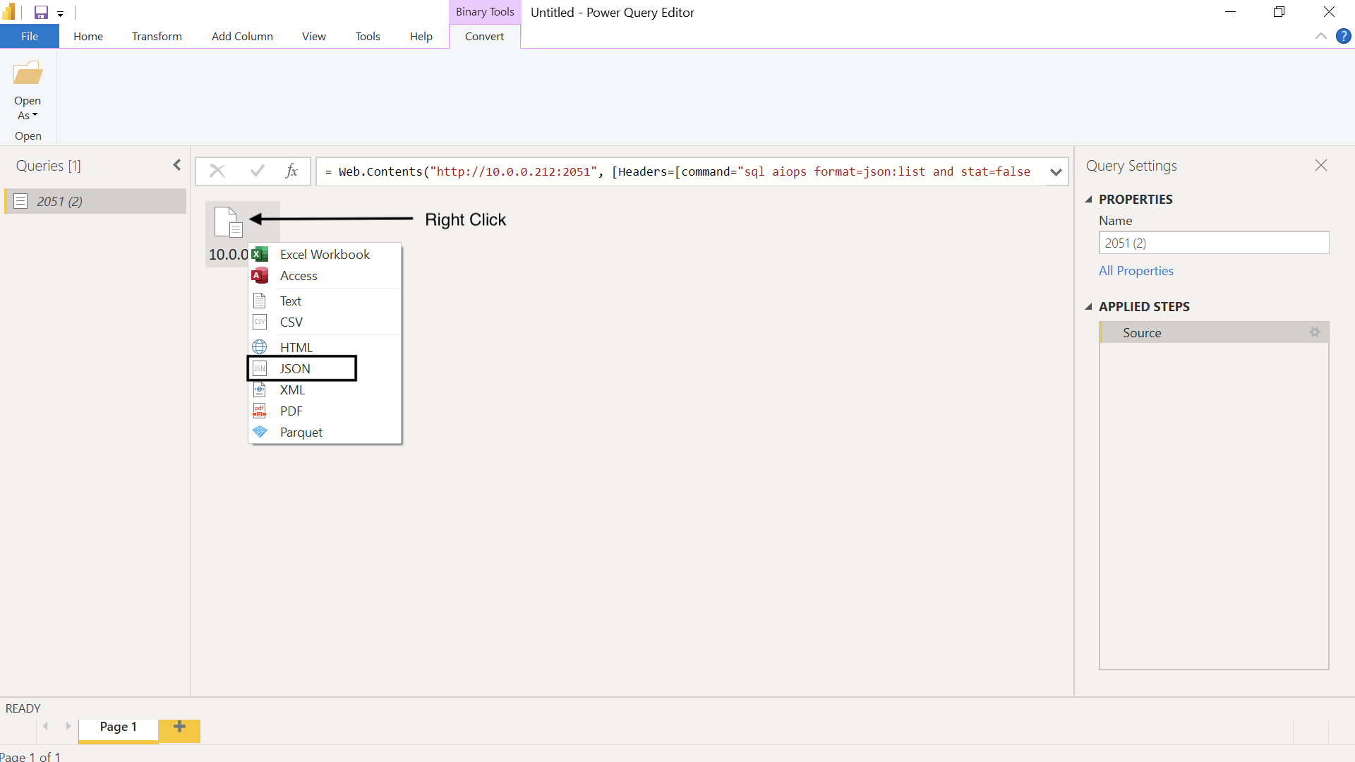
Right-click & select JSON
-
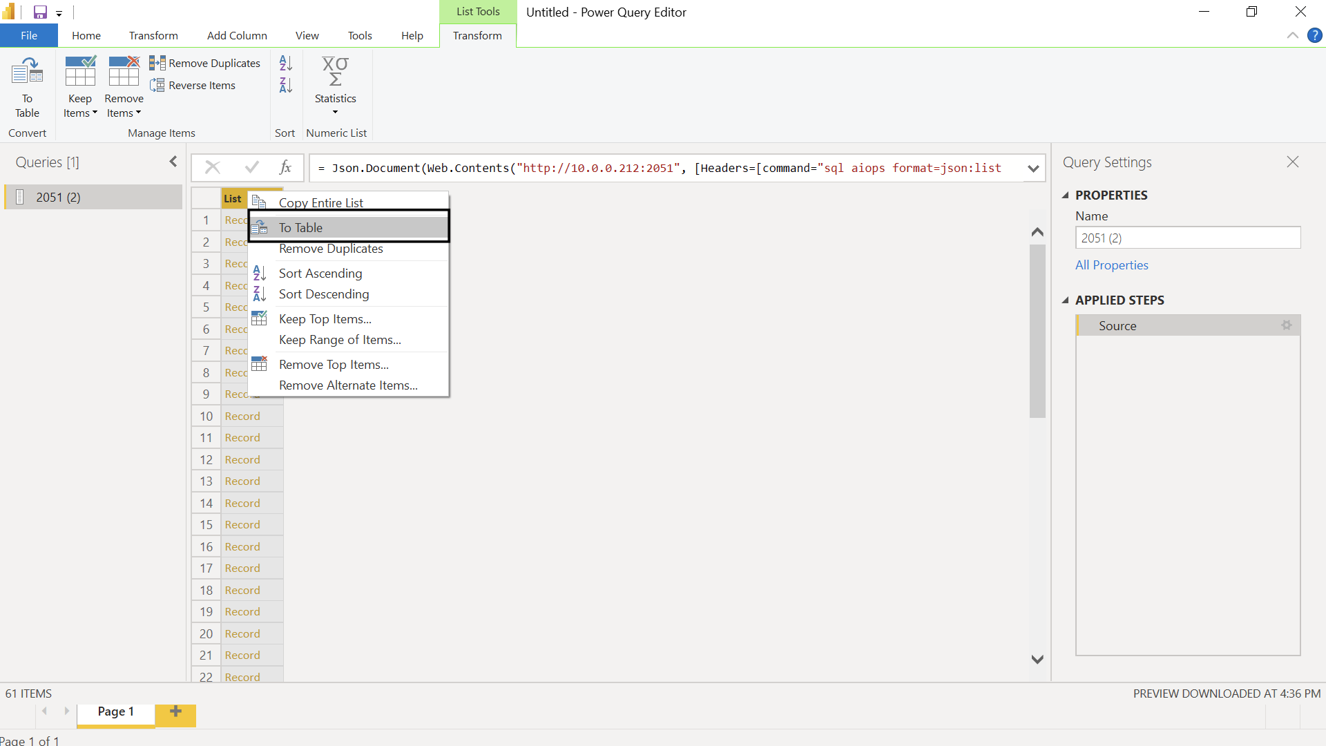
Right-click on List & select To Table
-
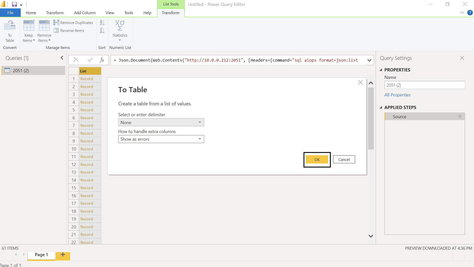
Keep defaults (None) and press “OK”
-
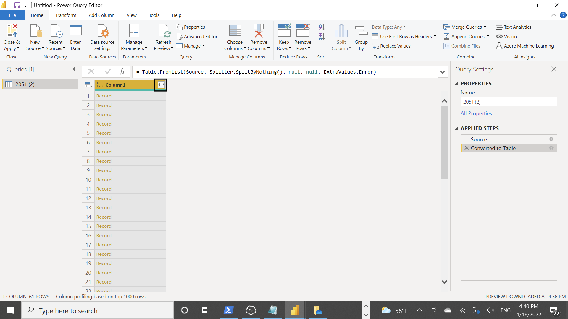
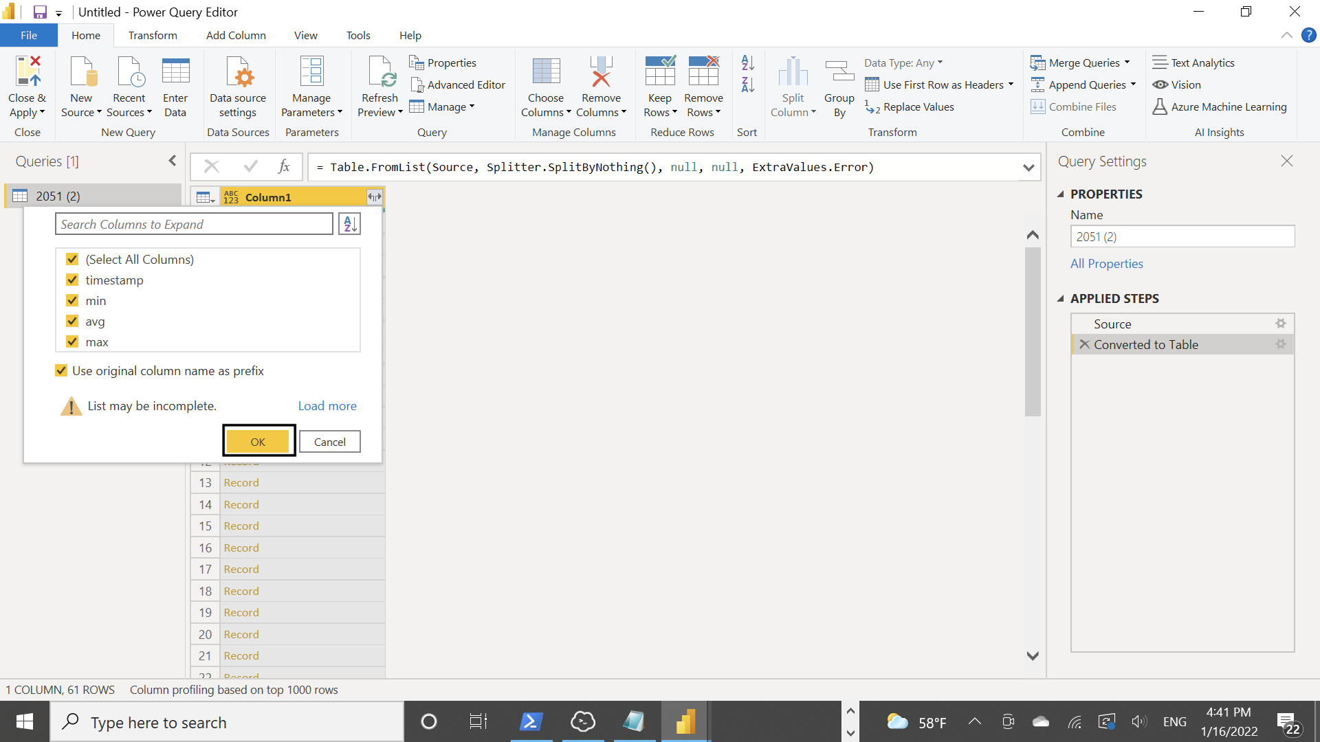
Press the button on the right of the column to view the list of columns. This will show the different JSON keys that’ll be converted to table columns
 |  |
-
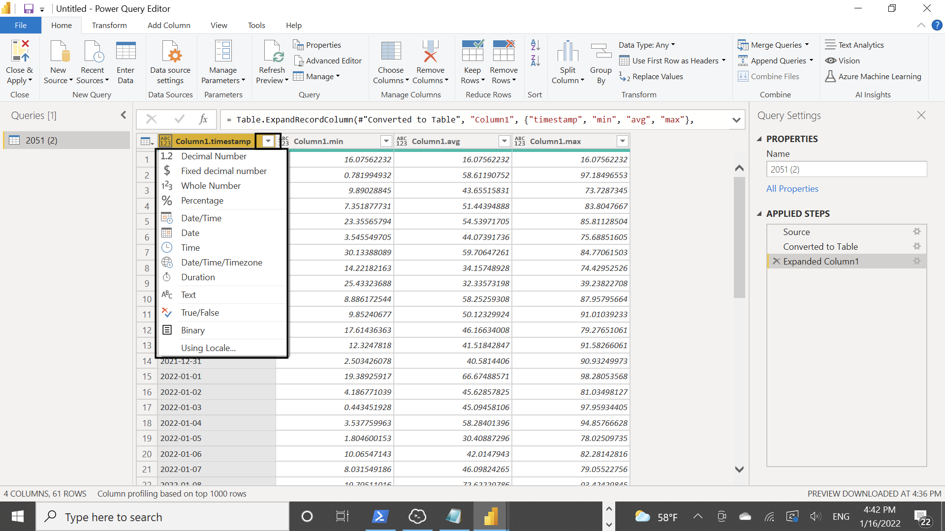
For each column, you should update to the correct data type — otherwise PowerBI will assume the data type is string
-
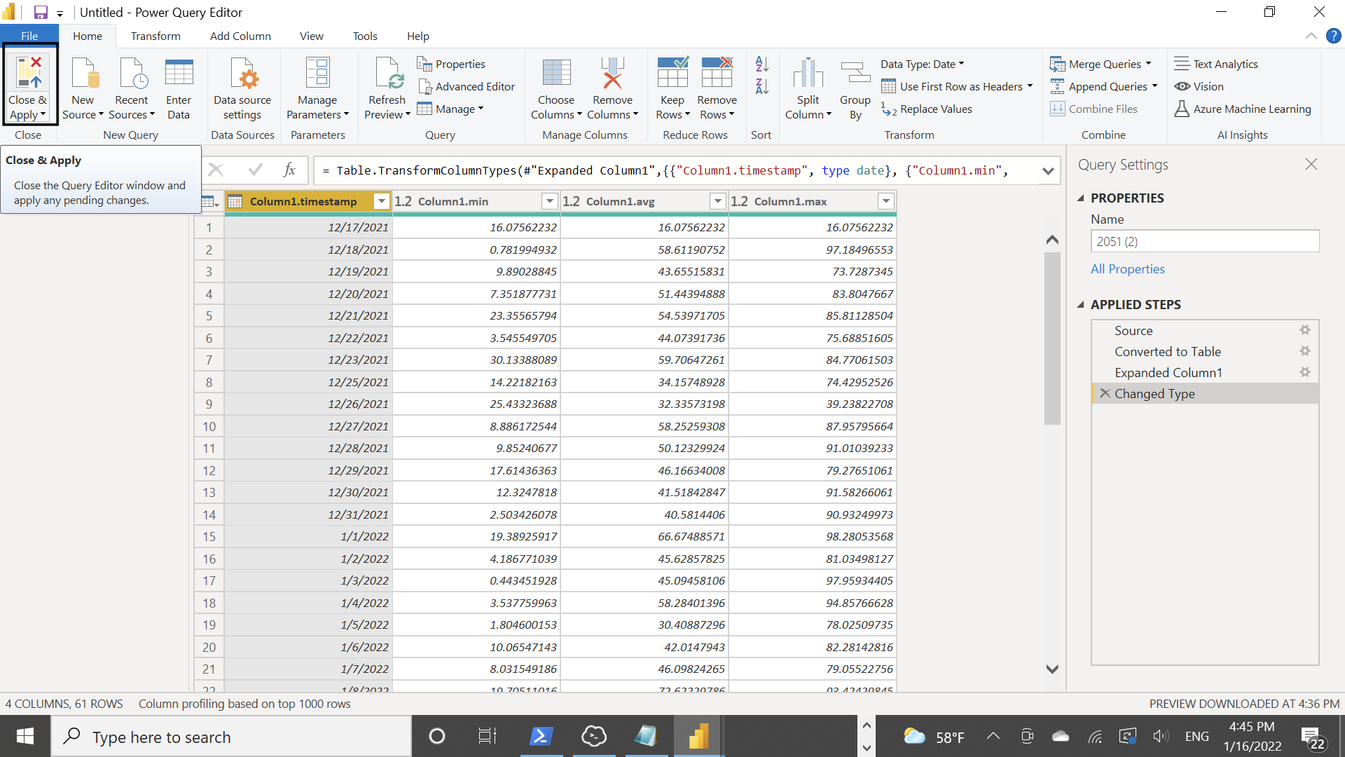
Once updated, press Close & Apply
-
From this point you should be able to draw tables & graphs with the data
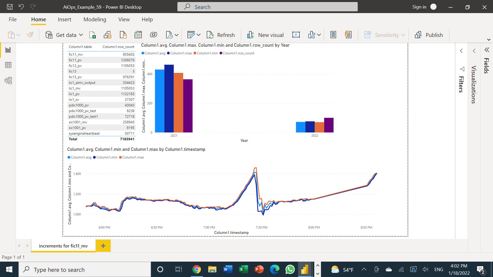
The following shows 3 diagrams, each assigned to its own query:
- The table shows the number of rows per table in the database
- The bar graph shows MIN, MAX, AVG, and Row Count difference between 2021 and 2022
- The line graph uses the increments function for MIN, MAX, and AVG over time
Using Excel and other Microsoft Office tools to view data
-
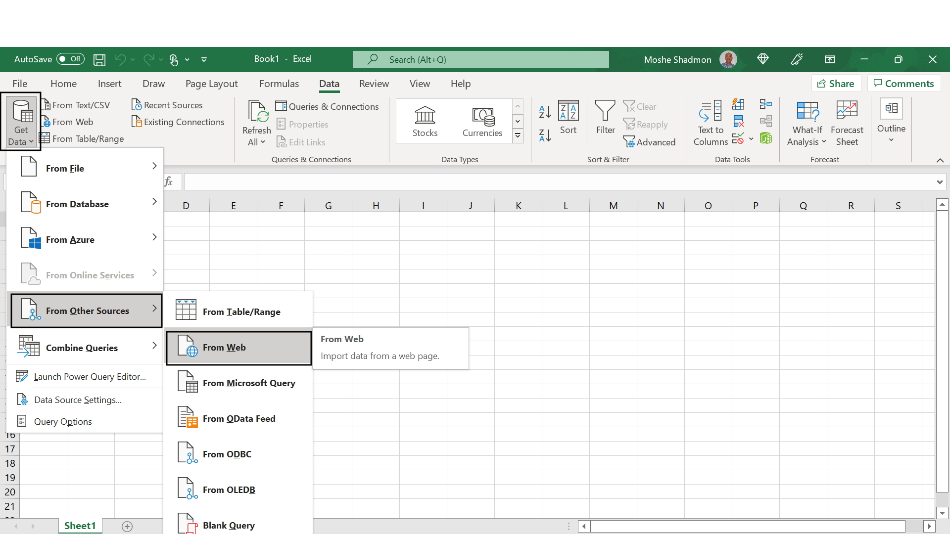
Under the Data tab, select the “Web” data source
-
In the Advanced option fill out the URL and HEADER parameters with
command,User-Agent, anddestination. Once the form is filled out, press “OK”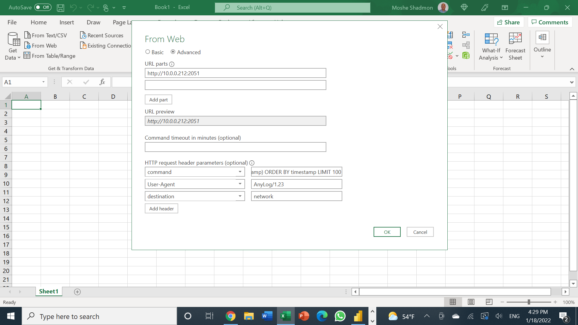
-
Right-click on List & select To Table
-
Keep defaults (None) and press “OK”
-
Press the button on the right of the column to view the list of columns. This will show the different JSON keys that’ll be converted to table columns
| |
-
For each column, you should update to the correct data type — otherwise Excel will assume the data type is string
-
Once updated, press Close & Apply
-
From this point you should be able to draw tables & graphs with the data
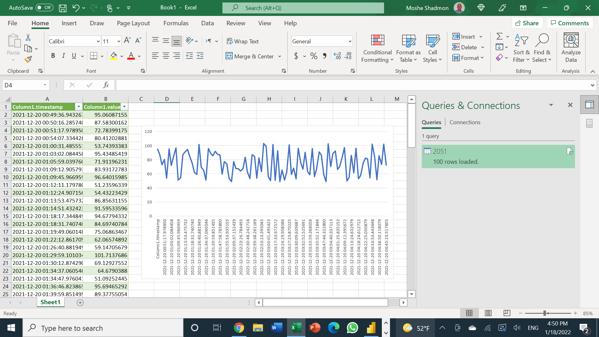
The diagram uses a single query with the period function to generate both the table and graph.
Error Handling
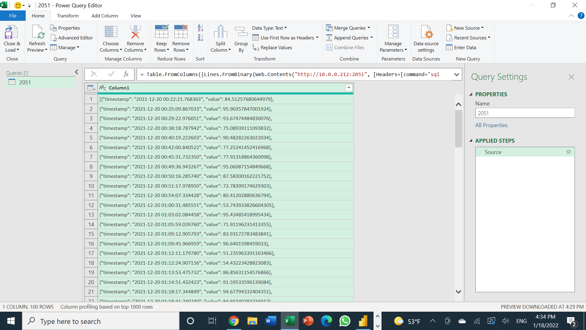
When converting raw content into Text, the PowerQuery Editor will show results — but it will not separate the JSON keys into separate columns.